A living room can feel completely different at 7 a.m. than it does at 9 p.m. In the morning, pale sunlight softens the walls; at night, a single lamp can turn the same corner into a warm cocoon.
That shift isn't just about light—it's about color. The right hues absorb, reflect, and shape emotion.
Cozy color magic isn't about painting everything dark or trendy; it's about understanding how specific shades shape the way a space feels and functions.
<h3>The Psychology of Warmth</h3>
<b>1. Warm Neutrals</b>
Soft beige, creamy ivory, and warm gray create an enveloping backdrop without overwhelming a room. Unlike stark white, which can feel clinical under cool lighting, warm neutrals contain subtle yellow or red undertones. These undertones reflect indoor light in a way that softens edges and reduces visual harshness. For example, pairing a warm gray wall with a linen sofa in oatmeal tones creates harmony because the undertones align. The result is calm rather than contrast.
<b>2. Earth-Inspired Shades</b>
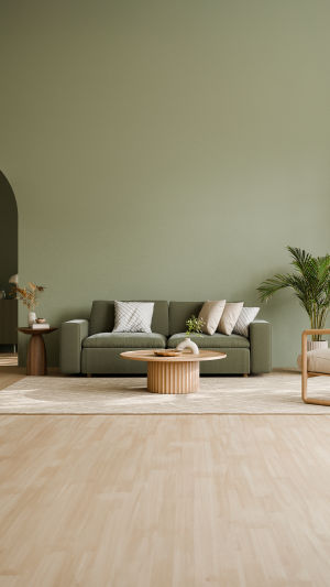
Clay, terracotta, muted olive, and dusty ochre draw inspiration from natural landscapes. These colors resonate because they echo materials we instinctively associate with shelter—soil, stone, wood. A reading nook painted in muted olive, combined with walnut shelves and a textured rug, feels grounded and intimate. The depth of these tones absorbs excess glare, which makes evening lighting feel gentler.
<b>3. Deep Accent Colors</b>
Coziness often comes from contrast. Deep navy, forest green, or charcoal used on one accent wall can visually anchor a space. Rather than shrinking the room, a darker wall behind a sofa or bed creates a focal point that adds depth. When balanced with lighter surrounding walls, the space feels layered rather than heavy.
<h3>Layering for Dimension</h3>
<b>1. Tone-on-Tone Pairing</b>
Using multiple shades within the same color family prevents flatness. A room anchored in soft taupe can include lighter cushions, a slightly darker rug, and mid-tone curtains. This subtle variation creates visual movement while preserving cohesion. Designers often rely on tone-on-tone layering because it builds richness without visual noise.
<b>2. Textural Contrast</b>
Color rarely works alone. Matte walls, velvet cushions, woven throws, and brushed metal fixtures all reflect light differently. A matte terracotta wall absorbs light, while a satin-finish lamp base reflects it. The combination deepens the perception of color. For instance, pairing a soft beige wall with a chunky knit throw introduces depth even if the palette remains restrained.
<b>3. Soft Transitions</b>
Abrupt color shifts can break the cozy illusion. Gradual transitions—such as blending wall color into curtains of a slightly lighter tone—help maintain flow. Open-plan spaces benefit from this technique. Instead of sharply dividing a living and dining area with contrasting hues, choose related shades that guide the eye naturally from one zone to the next.
<h3>Light as a Color Partner</h3>
<b>1. Understanding Undertones</b>
Natural daylight shifts throughout the day. North-facing rooms often have cooler light, which can make blue-based grays appear colder. In such spaces, selecting paint with subtle warm undertones prevents the room from feeling stark. Observing paint samples at different times—morning, afternoon, and evening—ensures the chosen shade behaves as expected.
<b>2. Layered Lighting</b>
Overhead lights alone flatten color. Incorporating table lamps, wall sconces, and floor lamps introduces depth. Warm white bulbs (typically around 2700–3000K) enhance cozy palettes by casting a gentle glow. Placing a lamp near a textured wall highlights subtle shadows, emphasizing dimension rather than washing the color out.
<b>3. Reflective Balance</b>
Mirrors and metallic accents amplify light, preventing darker cozy shades from feeling oppressive. A bronze-framed mirror opposite a window can bounce soft daylight across a deep green wall, preserving warmth without sacrificing brightness.
<h3>Personal Expression Within a Palette</h3>
<b>1. Signature Accent Pieces</b>
A cozy base palette allows room for personal touches. A rust-colored armchair, a deep teal ceramic vase, or a patterned cushion can inject individuality without disrupting harmony. Limiting bold accents to a few curated pieces keeps the atmosphere controlled and intentional.
<b>2. Seasonal Adaptation</b>
Color doesn't have to be permanent. Swapping cushion covers, throws, or artwork allows subtle seasonal shifts. Lighter linen textiles can refresh a room in warmer months, while heavier fabrics in richer tones restore intimacy when temperatures drop.
<b>3. Emotional Anchors</b>
Choose colors tied to memory or comfort. Perhaps a muted blue reminiscent of a favorite sweater or a sandy tone echoing a beloved coastal walk. These choices feel authentic because they connect design to lived experience rather than trend cycles.
Color is more than decoration; it's atmosphere made visible. When selected thoughtfully and layered with intention, it shapes how a room welcomes you at the end of a long day. A well-chosen palette doesn't shout for attention—it quietly supports comfort, conversation, and rest. The next time you stand before a wall of paint samples, pause and imagine not just how the color looks, but how it will feel at dusk, under lamplight, when the room is at its quietest. That's where cozy color magic truly begins.